Building a Stopwatch using only HTML and CSS
In a change of focus from recent articles, this blog post is about HTML and CSS. I was in a workshop recently where we were using a web-based timer to countdown the time left during breakout activities. During a lull in activities, I started thinking about how much of this could be built only with HTML and CSS — no Javascript and no frameworks. This blog post answers that question and illustrates many CSS features along the way.
The Rules
In these days of Javascript development frameworks like Angular and React, Javascript graphics libraries like D3.js, and CSS frameworks like Bootstrap, it is refreshing sometimes to go back to basics and build something without using them.
So, the first rules I set myself were:
- Only HTML and CSS (no Javascript)
- No frameworks, libraries, or modules
- No SVG
Then I thought about the functionality I wanted:
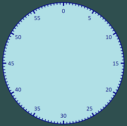
- A circular watch face with numerals indicating time left
- Major and minor marks around the edge of the clock face
- A hand which moves round the clockface to show time counting down
- Buttons to start and stop the hand
Finally, I wanted it to be easily sized and placed:
- Overall size and position is controlled by a single DIV
Although this wasn’t something useful for me to do (there are plenty of online timers), I thought it would be interesting to see how far I could go, and refresh myself on some concepts and learn some new ones.
The Clock Face
Let’s start off with our clock face. We’ll have a container DIV which contains all other components, then a clock DIV for the clock face, and segments for each of the twelve numerals. And let’s start with the first two segments to get an idea of how to build this:
<div class="container">
    <div class="clock">
        <div class="segment twelve">  0</div>
        <div class="segment one">     5</div>
    </div>
</div>
One thing I do to make CSS layout easier to think about is use the border-box layout. If you don’t know about that, it means that if you set a DIV to be 400px wide, that includes all the borders. The default with CSS is not to include the borders in that width, which gives me more things to track. The other thing I do is set all margins and padding to zero (so I don’t have to worry about default browser values). This means I start my CSS like this:
* {
    box-sizing: border-box;
    margin: 0px;
    padding: 0px;
}
Now on to our container. I’ll set default font information in here and also the height and width in pixels. We’re going to use a lot of absolute positioning to line up our clock face, and these only work if a parent DIV is also positioned. So I’ll also set the container to have a position of relative:
.container {
    position: relative;
    font-family: Helvetica;
    font-size: 20px;
    width: 400px;
    height: 400px;
}
Moving on to the clock face itself, we want that to be circular so we set a border-radius of 50%. We want it to take up the full size of our container, so we set the height and width to be 100%. From here on down, we will be using percentage dimensions in line with our rules of being able to control the size from one place. If I also include some colours, I get:
.clock {
    background: powderblue;
    border-color: darkblue;
    border-width: 2px;
    border-style: solid;
    border-radius: 50%;
    width: 100%;
    height: 100%;
}
Finally we consider our segments. We will have twelve of these (one for each numeral), which we will stack on top of each other (using position absolute), then use CSS transform to rotate round. We’ll set them all to be the same width (2em so they change with font size) and centre the text within them. We’ll make the segments 100% in height and put some padding at the top so there’s space to draw some half second tick marks around the edge of the face.
Because we are using absolute position, the segments will be at the left hand edge of the clock face. We want them in the centre, so we need to set a left value to achieve this. The question is how can we do this when the size of the clock face is a percentage and the width of the segment is 2em. Fortunately, there is a fantastic calc function in CSS. When I first encountered it, I thought it was part of some clever pre-processor, but it is actually pure CSS. You can give it an expression in different CSS size dimensions and it will calculate what that all comes down to. In our case, we want the left hand edge to be at 50% (so it is centred) then moved back by 1em (since our segment is 2em wide). Our expression is therefore:
calc(50% - 1em);
And, our full CSS for the segment is:
.segment {
    height: 100%;
    position: absolute;
    padding-top: 4%;
    width: 2em;
    left: calc(50% - 1em);
    text-align: center;
    top: 0px;
}
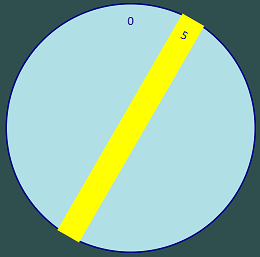
All that’s remaining is to rotate our one numeral by 30 degrees so that it is in the correct place. We use the transform operation for that. Transform rotates a DIV around a fixed point by a specified number of degrees. By default, that fixed point is the centre of the DIV. Since our segment is centred on the middle of our clock face, that default works perfectly for us.
So, we add in our rotation in our CSS:
.one { transform: rotate(30deg); }
This gives us the first part of our clock face (I’ve coloured the rotated segment in yellow, so it is clearer what is going on):
 See HTML version (opens in new page)
Adding the Numerals
Adding in the remaining numerals is straightforward. We just need to add in DIVs for each one:
<div class="container">
    <div class="clock">
        <div class="segment twelve">  0</div>
        <div class="segment one">     5</div>
        <div class="segment two">    10</div>
        <div class="segment three">  15</div>
        <div class="segment four">   20</div>
        <div class="segment five">   25</div>
        <div class="segment six">    30</div>
        <div class="segment seven">  35</div>
        <div class="segment eight">  40</div>
        <div class="segment nine">   45</div>
        <div class="segment ten">    50</div>
        <div class="segment eleven"> 55</div>
    </div>
</div>
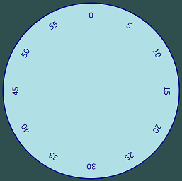
And then update our CSS to handle all the appropriate rotations:
.one    { transform: rotate(30deg);  }
.two    { transform: rotate(60deg);  }
.three  { transform: rotate(90deg);  }
.four   { transform: rotate(120deg); }
.five   { transform: rotate(150deg); }
.six    { transform: rotate(180deg); }
.seven  { transform: rotate(210deg); }
.eight  { transform: rotate(240deg); }
.nine   { transform: rotate(270deg); }
.ten    { transform: rotate(300deg); }
.eleven { transform: rotate(330deg); }
This gives us the following:
 See HTML version (opens in new page)
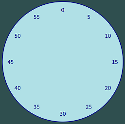
However, to make this easier to read, I wanted all the numerals to be oriented in the normal vertical way. This pretty simple to achieve. We add in DIVs around each numeral to isolate them from their segment:
<div class="container">
    <div class="clock">
        <div class="segment twelve"> <div class="numeral"> 0</div></div>
        <div class="segment one">    <div class="numeral"> 5</div></div>
        <div class="segment two">    <div class="numeral">10</div></div>
        <div class="segment three">  <div class="numeral">15</div></div>
        <div class="segment four">   <div class="numeral">20</div></div>
        <div class="segment five">   <div class="numeral">25</div></div>
        <div class="segment six">    <div class="numeral">30</div></div>
        <div class="segment seven">  <div class="numeral">35</div></div>
        <div class="segment eight">  <div class="numeral">40</div></div>
        <div class="segment nine">   <div class="numeral">45</div></div>
        <div class="segment ten">    <div class="numeral">50</div></div>
        <div class="segment eleven"> <div class="numeral">55</div></div>
    </div>
</div>
And then we rotate these inner DIVs back the same amount we rotated the segments:
.one    > .numeral { transform: rotate(-30deg); }
.two    > .numeral { transform: rotate(-60deg); }
.three  > .numeral { transform: rotate(-90deg); }
.four   > .numeral { transform: rotate(-120deg); }
.five   > .numeral { transform: rotate(-150deg); }
.six    > .numeral { transform: rotate(-180deg); }
.seven  > .numeral { transform: rotate(-210deg); }
.eight  > .numeral { transform: rotate(-240deg); }
.nine   > .numeral { transform: rotate(-270deg); }
.ten    > .numeral { transform: rotate(-300deg); }
.eleven > .numeral { transform: rotate(-330deg); }
I used the CSS greater than indicator (which only applies to immediate children of a class) because I thought I might use my numeral class in other places (although it turned out to be unnecessary).
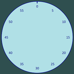
This gave me:
 See HTML version (opens in new page)
Adding the Tick Marks
I wanted to add major tick marks every 5 seconds and minor tick marks every half second. I decided to start with the major ones. From an HTML perspective, it was just adding a DIV (with class of major) which I could style:
<div class="container">
    <div class="clock">

        <div class="major"></div>

        <div class="segment twelve"> <div class="numeral"> 0</div></div>
        <div class="segment one">    <div class="numeral"> 5</div></div>
        <div class="segment two">    <div class="numeral">10</div></div>
        <div class="segment three">  <div class="numeral">15</div></div>
        <div class="segment four">   <div class="numeral">20</div></div>
        <div class="segment five">   <div class="numeral">25</div></div>
        <div class="segment six">    <div class="numeral">30</div></div>
        <div class="segment seven">  <div class="numeral">35</div></div>
        <div class="segment eight">  <div class="numeral">40</div></div>
        <div class="segment nine">   <div class="numeral">45</div></div>
        <div class="segment ten">    <div class="numeral">50</div></div>
        <div class="segment eleven"> <div class="numeral">55</div></div>
    </div>
</div>
I wasn’t completely sure how the maths would work for this, so I decided to start by just drawing a line from the edge to the centre. So the height of the DIV is 50% (of the height of the face) and I made it 1% of the width. This meant I had to set the left position to 49.5% to centre it.
Now, if you remember from earlier, the transform rotates around the centre of the DIV. For this, we want to rotate around the bottom of the line we draw. So we need to set a transform-origin. This takes two parameters (defined in terms of the width and height). We set the first one to be center (meaning the centre of the width) and the second to be 100% (meaning 100% down the height, or the bottom of the DIV).
This gives us the full CSS definition:
.major {
    height: 50%;
    width: 1%;
    position: absolute;
    background: darkblue;
    left: 49.5%;
    top: 0px;
    transform-origin: center 100%;
}
And it looks like this:
 See HTML version (opens in new page)
We only want a small tick mark, so let’s reduce the height of the line to only 25%. Because the height of the line has been halved, we need to double the transform-origin to ensure the line rotates around the same point. So the transform-origin now needs to be set at 200%:
.major {
    height: 25%;
    width: 1%;
    position: absolute;
    background: darkblue;
    left: 49.5%;
    top: 0px;
    transform-origin: center 200%;
}
This gives us a clock face like this:
 See HTML version (opens in new page)
Playing with these numbers, we can soon work out that to calculate the transform-origin, we need to divide 5000 by our height:
calc(5000% / h);
Note that we have to use a percentage sign in that expression, so that our result is also a percentage — I’m sure there’s a clever name for that in maths.
Because I want my major ticks to be 3% of the height of the clock, I get this final class definition:
.major {
    height: 3%;
    width: 1%;
    position: absolute;
    background: darkblue;
    left: 49.5%;
    top: 0px;
    transform-origin: center calc(5000% / 3);
}
This gives me one tick:
 See HTML version (opens in new page)
To add in all the ticks, we just need to add more DIVs with a class of major. We already have a class which rotates our numerals around the clock face and we can just use that to rotate our ticks too:
<div class="container">
    <div class="clock">
        <div class="major twelve"></div>
        <div class="major one"></div>
        <div class="major two"></div>
        <div class="major three"></div>
        <div class="major four"></div>
        <div class="major five"></div>
        <div class="major six"></div>
        <div class="major seven"></div>
        <div class="major eight"></div>
        <div class="major nine"></div>
        <div class="major ten"></div>
        <div class="major eleven"></div>

        <div class="segment twelve"> <div class="numeral"> 0</div></div>
        <div class="segment one">    <div class="numeral"> 5</div></div>
        <div class="segment two">    <div class="numeral">10</div></div>
        <div class="segment three">  <div class="numeral">15</div></div>
        <div class="segment four">   <div class="numeral">20</div></div>
        <div class="segment five">   <div class="numeral">25</div></div>
        <div class="segment six">    <div class="numeral">30</div></div>
        <div class="segment seven">  <div class="numeral">35</div></div>
        <div class="segment eight">  <div class="numeral">40</div></div>
        <div class="segment nine">   <div class="numeral">45</div></div>
        <div class="segment ten">    <div class="numeral">50</div></div>
        <div class="segment eleven"> <div class="numeral">55</div></div>
    </div>
</div>
Which gives us:
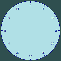 See HTML version (opens in new page)
The Minor Ticks
To add in the minor tick marks, we use a similar structure in our HTML:
<div class="minor minor-one"></div>
<div class="minor minor-two"></div>
<div class="minor minor-three"></div>
<div class="minor minor-four"></div>
<div class="minor minor-five"></div>
<div class="minor minor-six"></div>
<div class="minor minor-seven"></div>
<div class="minor minor-eight"></div>
<div class="minor minor-nine"></div>
We define minor in the same way as we did major:
.minor {
    height: 2%;
    width: 0.5%;
    position: absolute;
    background: darkblue;
    left: 49.75%;
    top: 0px;
    transform-origin: center calc(5000% / 2);
}
We also need to define the rotations for these marks:
.minor-one    { transform: rotate(3deg);  }
.minor-two    { transform: rotate(6deg);  }
.minor-three  { transform: rotate(9deg);  }
.minor-four   { transform: rotate(12deg); }
.minor-five   { transform: rotate(15deg); }
.minor-six    { transform: rotate(18deg); }
.minor-seven  { transform: rotate(21deg); }
.minor-eight  { transform: rotate(24deg); }
.minor-nine   { transform: rotate(27deg); }
Which gives us:
 See HTML version (opens in new page)
One way to get all the minor ticks in place would be to create 350 such classes, but a more concise way of achieving this would be to wrap the minor ticks into the major ticks. Then they will inherit the rotation of the major ticks and we don’t need to define new classes.
So the HTML will look like this:
<div class="major one">
    <div class="minor minor-one"></div>
    <div class="minor minor-two"></div>
    <div class="minor minor-three"></div>
    <div class="minor minor-four"></div>
    <div class="minor minor-five"></div>
    <div class="minor minor-six"></div>
    <div class="minor minor-seven"></div>
    <div class="minor minor-eight"></div>
    <div class="minor minor-nine"></div>
</div>
<div class="major two">
    <div class="minor minor-one"></div>
    <div class="minor minor-two"></div>
    <div class="minor minor-three"></div>
    <div class="minor minor-four"></div>
    <div class="minor minor-five"></div>
    <div class="minor minor-six"></div>
    <div class="minor minor-seven"></div>
    <div class="minor minor-eight"></div>
    <div class="minor minor-nine"></div>
</div>
...
We need to make a change to our minor class because it is now in terms of the major class not the clock class. So where we had a height of 2% before, we now change that to 60% (major was a height of 3%, so 60% of that is about 2%). We also need to update our calculation for the transform-origin similarly:
.minor {
    height: 60%;
    width: 50%;
    position: absolute;
    background: darkblue;
    left: 0px;
    top: 0px;
    transform-origin: center calc(100 / 60 * 5000% / 3);
}
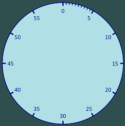
Now we have all our minor ticks too:
 See HTML version (opens in new page)
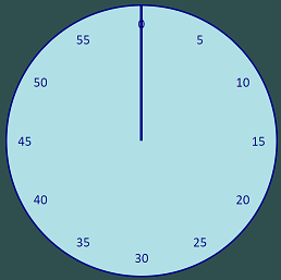
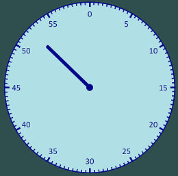
Adding the Hand
We add a hand and a dot as DIVs too:
<div class="segment twelve"> <div class="numeral"> 0</div></div>
<div class="segment one">    <div class="numeral"> 5</div></div>
<div class="segment two">    <div class="numeral">10</div></div>
<div class="segment three">  <div class="numeral">15</div></div>
<div class="segment four">   <div class="numeral">20</div></div>
<div class="segment five">   <div class="numeral">25</div></div>
<div class="segment six">    <div class="numeral">30</div></div>
<div class="segment seven">  <div class="numeral">35</div></div>
<div class="segment eight">  <div class="numeral">40</div></div>
<div class="segment nine">   <div class="numeral">45</div></div>
<div class="segment ten">    <div class="numeral">50</div></div>
<div class="segment eleven"> <div class="numeral">55</div></div>

<div class="dot"></div>
<div class="hand"></div>
The dot in the centre of the clock is just a small DIV with a 50% radius:
.dot {
    border: 0px;
    border-radius: 50%;
    background: darkblue;
    height: 4%;
    width: 4%;
    position: absolute;
    left: 48%;
    top: 48%;
}
Similarly, the hand is a DIV which is 35% of the radius of the clock face (so it stops short of the numerals) and we rotate it to an angle to indicate that it can move round the clock:
.hand {
    position: absolute;
    border-radius: 6px;
    background: darkblue;
    height: 35%;
    width: 2%;
    left: 49%;
    top: 15%;
    transform-origin: center bottom;
    transform: rotate(314deg);
}
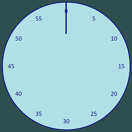
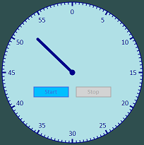
So we now have something which looks the part, with all elements in place:
 See HTML version (opens in new page)
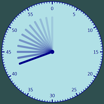
Making the Hand Move
Making the hand move is pretty simple, since CSS3 supports animation. The general principle is straightforward — we define key frames, which are the main points in the animation, and then we specify those key frames in an animation value in our CSS.
The key frames are defined in terms of CSS settings (rotation in our case) and at which percentage through the animation we want them to apply. The browser then interpolates the intermediate percentage positions to give a complete animation.
Our case is straightforward — at the start (or 0%) of the animation) we want our hand to be rotated fully (i.e. 360 degrees), and at the end (or 100%) of the animation, we want our hand to not be rotated (i.e. 0 degrees). This is stated in the CSS in this way:
@keyframes sweep {
    0% {
    	transform: rotate(360deg);
    }
    100% {
    	transform: rotate(0deg);
    }
}
We now just need to add an animation statement to our hand class:
.hand {
    position: absolute;
    border-radius: 6px;
    background: darkblue;
    height: 35%;
    width: 2%;
    left: 49%;
    top: 15%;
    transform-origin: center bottom;
    z-index: 200;
    animation: sweep 60s linear;
}
Note that we specify the name of the key frames (sweep), the duration of the animation (60s in our case, so we have a minute long timer) and also the style of animation, linear. Because this is a clock, we want a consistent speed of the animation, which is what linear gives us. The default of ease starts up slowly and ends slowly, which usually looks like a more natural animation, but doesn’t give the constant sweep that we are looking for in a stopwatch hand. So, to get the steady sweep, we use the linear qualifier.
Here’s an image of what it looks like, but I suggest you click through to the HTML version to actually see the result:
 See HTML version (opens in new page)
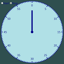
Adding Start and Stop Buttons
What we have so far is great in as far as it goes — we’ve got our clock face and a hand which sweeps round it. However, for this to be useful, we need to be able to choose when to start the hand moving (not just when the page loads) and to be able to stop and start it again.
Let’s add some buttons to do this. At this point, we need to think a bit more like a programmer and recognise that we are now introducing state into our stopwatch. We can either be in a state of stopped or a state of running. We therefore need somewhere to store our state. If we were using Javascript, we would store state in a variable, but our rules were we could only use HTML and CSS — so where can we put state? Well, form input fields will let us have state, like the text we put into a text input field. Since we have pre-defined states and only one of them can be active at any time, a radio button would be a good fit for us. So, let’s add that to our HTML:
<div class="segment twelve"> <div class="numeral"> 0</div></div>
<div class="segment one">    <div class="numeral"> 5</div></div>
<div class="segment two">    <div class="numeral">10</div></div>
<div class="segment three">  <div class="numeral">15</div></div>
<div class="segment four">   <div class="numeral">20</div></div>
<div class="segment five">   <div class="numeral">25</div></div>
<div class="segment six">    <div class="numeral">30</div></div>
<div class="segment seven">  <div class="numeral">35</div></div>
<div class="segment eight">  <div class="numeral">40</div></div>
<div class="segment nine">   <div class="numeral">45</div></div>
<div class="segment ten">    <div class="numeral">50</div></div>
<div class="segment eleven"> <div class="numeral">55</div></div>

<input type="radio" id="start-button" class="start-button" name="action" value="start">
<label for="start-button">Start</label>
<input type="radio" id="stop-button" class="stop-button" name="action" value="stop" checked>
<label for="stop-button">Stop</label>

<div class="dot"></div>
<div class="hand"></div>
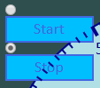
It’s worth commenting on some points in the above code snippet. I have supplied both an id and a class, so I can use the class for styling and the id to reference the radio button. I have set the initial state to be stopped using the checked attribute. I am using the values start and stop as our two states, to better reflect the action the button will perform. Most importantly, I am using the label tag with a for attribute for the text associated with the button. This makes the label clickable as well as the radio button itself — which will be key to styling this.
So our clock face now looks like this:
Or to zoom in on the buttons:

Let’s style these to look more like standard buttons. What we are going to do is style the labels, then hide the actual radio buttons (remembering they will still be clickable via the label, as discussed earlier). So, let’s add some borders, background colours, a suitable cursor, etc:
label {
    display: block;
    color: royalblue;
    border-width: 2px;
    border-style: solid;
    border-color: royalblue;
    background: deepskyblue;
    cursor: pointer;
    font-size: 18px;
    text-align: center;
    margin: 0px;
    padding: 0px;
    width: 100px;
    height: 30px;
    line-height: 24px;
}
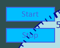
This takes us to buttons like this:
Now we need to hide the actual radio button. We can’t use standard techniques for this (like display: none) because then the radio button can’t be interacted with. So, what we do is adjust the opacity so that it is so faint as to be invisible, but is still actually part of the page:
input[type="radio"] {
    opacity: 0.001;
}
Now let’s use absolute positioning, to move the buttons into our clock face. So we add the following to our label styling, which moves both buttons to the correct vertical positioning.
label {
    ...
    position: absolute;
    top: 60%;
}
For the horizontal positioning, we have a slight problem since we want them to end up in different horizontal locations. The way we can tell apart our two radio buttons is in the radio input tag itself, but the thing we want to style is the label. Fortunately, CSS has an adjacent sibling selector we can use in exactly that situation. Suppose we have the following:
.selector-1 + .selector-2 { /* some styling */ }
The styling would be applied to selector-2, but only when it immediately follows selector-1 and they both share a common parent. In our case, we can use this to refer to the label associated with the start button:
.start-button + label {
    left: calc(50% - 110px);
}
We do the same for the stop button:
.stop-button + label {
    left: calc(50% + 10px);
}
We now have our buttons in the right place:
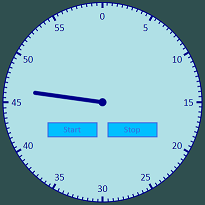
Finally, let’s give our users a visual cue as to which button is currently active, by making it grey (so the button which makes sense to click is more prominent). We can do this using the adjacent sibling selector too:
input[type="radio"]:checked + label {
    background: lightgrey;
    color: darkgrey;
    border-color: darkgrey;
}
This gives us our initial state of the start button being available to click:
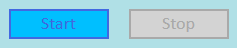
And when we click on it, the stop button becomes available to click:

And in context:
 See HTML version (opens in new page)
Now, if you follow the link to the HTML version, you will see that although the buttons do work (in the sense that they can be clicked on and there is visual feedback), they don’t affect the movement of the hand itself. This is the final thing we will consider.
Making the Buttons Work
At this point, I’d probably be thinking of adding some sort of click handler to the buttons in a Javascript framework like Angular or React (or even jQuery) to control the hand starting and stopping. But this option isn’t available to me because of my no Javascript rule. So, what can I do with CSS?
Well, the first thing to note is that earlier we saw how setting an animation value gives us the ability to move the hand. So, if we can add and remove that animation setting from the hand class in our CSS, we can turn the movement of the hand on and off. So, let’s start by going back to our hand class and removing the animation:
.hand {
    position: absolute;
    border-radius: 6px;
    background: darkblue;
    height: 35%;
    width: 2%;
    left: 49%;
    top: 15%;
    transform-origin: center bottom;
}
Now let’s think about how we can add in the animation only when the select button is checked. We’ve already seen how we can use the adjacent sibling selector to apply styling to a label which follows a radio input, and we can build on that. As well as an adjacent sibling selector, CSS gives us a general sibling selector (which uses a tilde character):
.selector-1 ~ .selector-2 { /* some styling */ }
In this example, selector-2 gets the specified styling applied to it, if it has a sibling which matches selector-1. In our case, selector-1 would be that the start button is checked, and selector-2 would be the hand:
.start-button:checked ~ .hand {
    animation: sweep 60s linear;
}
This looks the same as the previous example, so follow the link to the HTML version to try it out:
See HTML version (opens in new page)
Summary
We have built a working countdown stopwatch, using only HTML and CSS. We have used the following items to achieve this:
- CSS rotate transform
- Immediate child selector
- The calc function
- Positioning elements with absolute
- CSS animations
- CSS key frames
- Styling radio buttons as regular buttons
- Adjacent sibling selector
- General sibling selector
- Using CSS to link buttons to actions
Because we have used good CSS principles (like not using id for styling, and using relative size and position), we can put multiple instances of these on a single page, with different sizes and colours, each operating independently:
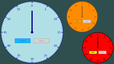 See HTML version (opens in new page)
Final Comments
If you follow the link to the last HTML version, you will also see that additional effects can be layered on top of what we have built here — so one of the clock faces cycles through green, amber and red as the time remaining reduces.
Other possibilities for extending this would be:
- A clock which counts up instead of down
- Change the key frames for the animation
- A conventional clock
- Change the key frames to go up, rather than down
- Change the animation duration to one hour rather than one minute
- Add another hand with an animation duration of 12 hours
- Choosing the duration for the timer from a dropdown menu
- Add a dropdown menu with suitable intervals (e.g. 1 minute, 5 minutes, 10 minutes, 15 minutes, 30 minutes, 1 hour)
- Create a set of animations which correspond to those intervals
- Use a general sibling selector based on the dropdown menu, which swaps in the correct animation
If you want to try extending this, you can download the code I’ve used here from my Github repo:
ianfinch/stopwatch